cookieChoices = {};

Friday 24 July 2015

Find Mouse events using java script

<!DOCTYPE html>
<html xmlns="http://www.w3.org/1999/xhtml">
<head>
    <title></title>
   
</head>
<body>
    <input type="button" name="btn" value="Demo" onmousedown="riasedevent(event)" onmouseup="riasedevent(event)"
           ondblclick="riasedevent(event)" />

    <div id="results"></div>

    <script type="text/javascript">
    var result;
    function riasedevent(event) {
        result = "";
        event = event || window.event;

        document.getElementById("results").innerHTML += event.type + "<br/>";
    }

   
    </script>

</body>
</html>

Find Which mouse button is clicked

<!DOCTYPE html>
<html xmlns="http://www.w3.org/1999/xhtml">
<head>
    <title></title>
    <script type="text/javascript">

        document.oncontextmenu = defaultactiondisable; // this line is to disable right click on web page

        function btnidentifyfunction() {
            var btnresult;

            if (event.which) {
                switch (event.which) {

                    case 1: btnresult = "left one"; break;
                    case 2: btnresult = "mid one"; break;
                    case 3: btnresult = "right one"; break;
                    default: btnresult = "invalid"; break;
                }
            }
            else {
                switch (event.button) {

                    case 1: btnresult = "left one"; break;
                    case 2: btnresult = "mid one"; break;
                    case 3: btnresult = "right one"; break;
                    default: btnresult = "invalid"; break;
                }
            }

            document.write(btnresult);
        }
       
    </script>
</head>
<body>
    <h1>This is demo to identify which mouse button is clicked</h1>

    <input type="button" name="name" value="Demo" onclick="btnidentifyfunction(event)" />
</body>
</html>

Disable link button default action in html

Example:

<!DOCTYPE html>
<html xmlns="http://www.w3.org/1999/xhtml">
<head>
    <title></title>
    <script type="text/javascript">

        document.oncontextmenu = defaultactiondisable; // this line is to disable right click on web page

        function defaultactiondisable(event) {
            event = event || window.event;

            if(event.preventDefault)
            {
                event.preventDefault // this is for ie9 and later versions
            }
            else
            {
                event.returnValue = false;  //This is ie8 and earlier versions
            }
        }

    </script>
</head>
<body>
    <h1>This is demo of prevent default action of link button </h1>

    <a href="www.google.com" onclick="defaultactiondisable(event)">Go to Search</a>
</body>
</html>

Disable Browser right click


using oncontextmenu we can disable right click on browser web page.


Example:

<!DOCTYPE html>
<html xmlns="http://www.w3.org/1999/xhtml">
<head>
    <title></title>
</head>
<body oncontextmenu="return false">
    <h1> This is demo of disable right click in web page</h1>
</body>
</html>

Introduction


Introduction


  • It is Scripting language.
  • make the html web pages dynamic using this.
  • creates  interactivity to html tags.
  • we can embedded the java script in to html tags.
  • open source.
  • light weight programming language.
  • case sensitive.
  • data types: numbers, Boolean and strings.
  • var is the keyword to create any of the data types.
  • dynamically typed language, datatypes are changes automatically.
  • // -- single line comment and /* -------------*/ double line comments.
  • code is placed in between the <script>...........</script> tags.  

Tuesday 21 July 2015

Working with Images

Class                                           Description 
img-rounded                       Adds rounded corners to an image (not available in IE8)
img-circle                        Shapes the image to a circle (not available in IE8)
img-thumbnail                Shapes the image to a thumbnail & adds a bit of padding and a gray border
img-responsive             Makes an image responsive (will scale nicely to the parent element)
push-left                        To align image towards left of text
push-right                      To align image to right side of text .


Example: 

<div class="row" style="background-color:black">
    <img src="/images/gradient_radial.jpg" class="col-sm-offset-3 col-sm-2 img-rounded">
    <img src="/images/gradient_radial.jpg" class="col-sm-2 img-circle ">
    <img src="/images/gradient_radial.jpg" class="col-sm-2 img-thumbnail">
</div>

Note that the images restore their original size if the width of browser is reduced (smaller resolution devices).

  •  To align image to right / left of paragraph use "pull-right" / "pull left" 
  • To resize Image with change of resolution use "img-responsive" 

<img src="/images/Background.jpg" class="col-sm-4 pull-right img-responsive"> 

This is text around image This is text around image This is text around image This is text around image This is text around image This is text around image This is text around image This is text around image This is text around image This is text around image   

Bootstrap Button

Button can be rendered using one of the following ways:

1. <a class="btn btn-default" href="#" role="button">Link</a>
2. <button class="btn btn-default" type="submit">Button</button>
3. <input class="btn btn-default" type="button" value="Input">
4. <input class="btn btn-default" type="submit" value="Submit">

Its recommended to use <button> over <input> because it ensures matching cross-browser rendering.

Following are the styles we can use for <button>, <input type="button" and <a> tags:

Class                     Description 
btn                      Default/ Standard button.
btn-primary        Provides extra visual weight and identifies the primary action in a set of buttons.
btn-success         Indicates a successful or positive action.
btn-info              Contextual button for informational alert messages.
btn-warning       Indicates caution should be taken with this action.
btn-danger          Indicates a dangerous or potentially negative action.
btn-link             Deemphasize a button by making it look like a link while maintaining button behavior.
btn-sm             Makes a small button
btn-xs              Makes an extra small button
btn-block         Makes a block-level button (spans the full width of the parent element)
active               Makes the button appear pressed
disabled           Makes the button disabled

Examples: 

<button type="button" class="btn btn-default btn-lg">Default Button</button>
 <button type="button" class="btn btn-primary btn-lg ">Primary button</button>
 <button type="button" class="btn btn-link">Button as Link</button>
 <a href="#" class="btn btn-default btn-lg" role="button">Link as Button</a>

 <a href="#" class="btn btn-primary btn-lg" role="button">Link as Primary Button</a> 

Bootstrap Form Layout


  •  Individual form controls automatically receive some global styling. 
  •  All textual <input>, <textarea>, and <select> elements with .form-control are set to width: 100%. 
  • Wrap labels and controls in .form-group for optimum spacing.
  •  Includes support for all HTML5 types: datetime, datetime-local, date, month, time, week, number, email, url, search, tel, and color.

Bootstrap provides you with following types of form layouts: 
  •  Vertical (default) form.
  •  Inline form.
  •  Horizontal form.

Vertical or basic form 

The basic form structure comes with Bootstrap; individual form controls automatically receive some global styling. 

To create a basic form do the following:
  •   Add a role form to the parent <form> element. 
  •  Wrap labels and controls in a <div> with class .form-group. This is needed for optimum spacing. 
  •  Add a class of .form-control to all textual <input>, <textarea>, and <select> elements.
<form role="form"> 
     <div class="form-group"> 
         <label for="email">Email address:</label> 
         <input type="email" class="form-control" id="email"> 
     </div> 
     <div class="form-group"> 
         <label for="pwd">Password:</label> 
         <input type="password" class="form-control" id="pwd"> 
     </div> 
     <div class="checkbox"> 
         <label><input type="checkbox"> Remember me</label> 
     </div> 
     <button type="submit" class="btn btn-default">Submit</button> 
 </form>  

In-line Form:

  • Makes a <form> left-aligned with inline-block controls. 
  • This only applies to forms within viewports that are at least 768px wide.
  •  In the above example, add the attribute class="form-inline". 
<form role="form" class="form-inline">

Note:  
  •  Inputs, selects, and textareas are 100% wide by default in Bootstrap. To use the inline form, you'll have to set 
    a width on the form controls used within. 
  •  Screen readers will have trouble with your forms if you don't include a label for every input. For these inline 
    forms, you can hide the labels using the .sr-only class. 
<form class="form-inline" role="form"> 
    <div class="form-group"> 
        <label class="sr-only" for="email2">Email address</label> 
        <input type="email" class="form-control" style="width:200px" id="email2" placeholder="Enter email"> 
    </div> 
    <div class="form-group"> 
        <label class="sr-only" for="password1">Password</label> 
        <input type="password" class="form-control" id="password1" placeholder="Password"> 
    </div> 
    <div class="checkbox"> 
        <label> 
            <input type="checkbox"> Remember me 
        </label> 
    </div> 
    <button type="submit" class="btn btn-default">Sign in</button> 
</form>  

Horizontal Form: We can use Bootstrap's predefined grid classes to Aligns labels and groups of form controls in a horizontal layout. 
Note: The class .form-groups behaves as grid rows, so no need for .row

<form class="form-horizontal" role="form"> 
     <div class="form-group"> 
         <label class="control-label col-sm-2" for="email">Email:</label> 
         <div class="col-sm-10"> 
             <input type="email" class="form-control" id="email" placeholder="Enter email"> 
         </div> 
     </div> 
     <div class="form-group"> 
         <label class="control-label col-sm-2" for="pwd">Password:</label> 
         <div class="col-sm-10"> 
  <input type="password" class="form-control" id="pwd" placeholder="Enter password"> 
         </div> 
     </div> 
     <div class="form-group"> 
         <div class="col-sm-offset-2 col-sm-10"> 
             <div class="checkbox"> 
                 <label><input type="checkbox"> Remember me</label> 
             </div> 
         </div> 
     </div> 
     <div class="form-group"> 
         <div class="col-sm-offset-2 col-sm-10"> 
             <button type="submit" class="btn btn-default">Submit</button> 
         </div> 
     </div> 
 </form>  

Rendering of Checkbox and Radio 

By default all checkbox and radio buttons are rendered vertical.  
To show them in-line use the attribute: checkbox-inline or radio-inline 

<form class="form-horizontal" role="form"> 
    <div class="checkbox"> 
        <label><input type="checkbox" value="">Option 1</label> 
    </div> 
    <div class="checkbox disabled"> 
        <label><input type="checkbox" value="">Option 2</label> 
    </div> 
    <div class="checkbox"> 
        <label><input type="checkbox" value="">Option 3</label> 
    </div> 
    <div> 
        <label class="checkbox-inline"> 
            <input type="checkbox" id="inlineCheckbox1" value="option1"> Option 1 
        </label> 
        <label class="checkbox-inline"> 
<input type="checkbox" id="inlineCheckbox2" value="option2"> Option 2 
        </label> 
        <label class="checkbox-inline"> 
            <input type="checkbox" id="inlineCheckbox3" value="option3"> Option 3 
        </label> 
    </div> 
</form>  

Use the class .form-control-static on a <p>, when you need to place plain text next to a form label within a 
horizontal form. 

<label class="col-sm-2 control-label">Email</label> 
<div class="col-sm-10"> 
    <p class="form-control-static">email@example.com</p> 
</div> 

Validation States: 

To use, simply add the appropriate class (.has-warning, .has-error, or .has-success) to the parent element

<div class="form-group has-success"> 
    <label for="inputSuccess"> 
        Input with success 
    </label> 
    <div> 
        <input type="text" class="form-control" id="inputSuccess"> 
    </div> 
</div>  

Disabled inputs and fieldsets: 

<form role="form"> 
    <fieldset disabled > 
        <div class="form-group"> 
            <label for="t1">Disabled input</label> 
            <input type="text" id="t1" class="form-control" placeholder="Disabled input"> 
        </div> 
        <div class="form-group"> 
            <label for="s1">Disabled select menu</label> 
 <select id="s1" class="form-control"> 
                <option>Disabled select</option> 
            </select> 
        </div> 
        <div class="checkbox"> 
            <label> 
                <input type="checkbox"> Can't check this 
            </label> 
        </div> 
        <button type="submit" class="btn btn-primary">Submit</button> 
    </fieldset> 
</form>

Control Height Sizing: Set heights using classes like .input-lg 

<form role="form"> 
     <input class="form-control input-lg" type="text" placeholder=".input-lg"> 
     <input class="form-control" type="text" placeholder="Default input"> 
     <input class="form-control input-sm" type="text" placeholder=".input-sm"> 
 </form>  

Control Width Sizing: set widths using grid column classes like .col-sm-*. 

<form role="form" class="form-horizontal"> 
    <div class="row"> 
        <div class="col-sm-2"> 
            <input type="text" class="form-control" placeholder=".col-sm-2"> 
        </div> 
        <div class="col-sm-3"> 
            <input type="text" class="form-control" placeholder=".col-sm-3"> 
        </div> 
        <div class="col-sm-4"> 
            <input type="text" class="form-control" placeholder=".col-sm-4"> 
        </div> 
    </div> 
</form>  


Bootstrap Tables

<table> classes: 

Class                Description 
table Adds      basic styling (light padding and only horizontal dividers) to any <table>
table-striped   Adds alternate row style (not available in IE8)
table-bordered Adds border on all sides of the table and cells

table-hover     Enables a hover state on table rows within <tbody>
table-condensed Makes table more compact by cutting cell padding in half
table-responsive Makes the table responsive to different resolution

<table class="table table-striped table-bordered table-hover">
    <thead>
        <tr>
            <th>#</th>
            <th>Name</th>
        </tr>
    </thead>
    <tbody>
        <tr>
            <td>1</td>
            <td>John</td>
        </tr>
        <tr>
            <td>2</td>
            <td>Ravi</td>
        </tr>
        <tr>
            <td>3</td>
            <td>Srinivas</td>
        </tr>
    </tbody>
</table>

<tr>, <th> and <td> Contextual Classes 
Use the classes below to color table rows or cells:

Class            Description 
active           Applies the hover color to a particular row or cell
success         Indicates a successful or positive action
info               Indicates a neutral informative change or action
warning         Indicates a warning that might need attention
danger          Indicates a dangerous or potentially negative action

Responsive Tables: 

By wrapping any .table in .table-responsive class, you will make the table scroll horizontally up to small devices
(under 768px). When viewing on anything larger than 768px wide, you will not see any difference in these tables.


<div class="table-responsive">
     <table class="table">
         <caption>Responsive Table Layout</caption>
         <thead>
             <tr>
                 <th>Product</th>
                 <th>Payment Date</th>
                 <th>Status</th>
             </tr>
         </thead>
         <tbody>
             <tr>
                 <td>Product1</td>
                 <td>23/11/2013</td>
                 <td>Pending</td>
             </tr>
             <tr>
                 <td>Product2</td>
                 <td>10/11/2013</td>
                 <td> Delivered Delivered Delivered Delivered Delivered Delivered Delivered Delivered Delivered
Delivered Delivered Delivered Delivered Delivered Delivered Delivered Delivered Delivered Delivered Delivered
Delivered Delivered Delivered Delivered Delivered Delivered Delivered </td>
             </tr>
         </tbody>
     </table>
 </div>

Bootstrap Typography

Bootstrap uses Helvetica Neue, Helvetica, Arial, and sans-serif in its default font, font-size of 14px, and a line height of 1.428. In addition, <p> receive a bottom margin of half their computed line-height (10px by default).

Using typography feature of Bootstrap you can create headings, paragraphs, lists and other inline elements.

Headings:  Bootstrap formats heading differently from that of browser default.

<small> element will create a lighter, secondary text in any heading


<mark>highlight</mark>
<abbr title="World Health Organization">WHO</abbr>
<del>This is deleted text</del>
<blockquote>
     <p>This is some descriptive text This is some descriptive text This is some descriptive text This is some
descriptive text This is some descriptive text This is some descriptive text This is some descriptive text </p>
     <footer>From Author Name</footer>
 </blockquote>
Note: Add .blockquote-reverse for a blockquote to right-aligned content.
<small>This content is within small tag</small><br>
<strong>This content is within strong tag</strong><br>
<em>This content is within em tag and is rendered as italics</em><br>
<p class="lead">This is an example paragraph demonstrating the use of lead body copy.</p>
<p class="text-left">Left aligned text.</p>
<p class="text-center">Center aligned text.</p>
<p class="text-right">Right aligned text.</p>
<p class="text-muted">This content is muted</p>
<p class="text-primary">This content carries a primary class</p>
<p class="text-success">This content carries a success class</p>
<p class="text-info">This content carries a info class</p>
<p class="text-warning">This content carries a warning class</p>
<p class="text-danger">This content carries a danger class</p>
<p class="text-lowercase">Lowercased text.</p>
<p class="text-uppercase">Uppercased text.</p>
<p class="text-capitalize">Capitalized text.</p>
<address>
    <strong>Some Company Pvt Ltd...</strong><br>
    Street No 007<br>
    Some City, State XXXXX<br>
    <abbr title="Phone">P:</abbr> (123) 456-7890
</address>
<address>
    <strong>James</strong><br>
    <a href="mailto:mailto@somedomain.com">mailto@somedomain.com</a>
</address>
<h4>Example of Ordered List</h4>
<ol>
    <li>Item 1</li>
    <li>Item 2</li>
</ol>
<h4>Example of Un-Ordered List</h4>
<ul>
    <li>Item 1</li>
    <li>Item 2</li>
</ul>
<h4>Example of Unstyled List</h4>
<ul class="list-unstyled">
    <li>Item 1</li>
    <li>Item 2</li>
</ul>
<h4>Example of Inline List - Place all list items on a single line and some light padding.</h4>
<ul class="list-inline">
    <li>Item 1</li>
    <li>Item 2</li>
</ul>
<h4>Example of Definition List</h4>
<dl>
    <dt>Description 1</dt>
    <dd>This is description of Item 1</dd>
<dt>Description 2</dt>
    <dd>This is description of Item 2</dd>
</dl>
<h4>Example of Horizontal Definition List</h4>
<dl class="dl-horizontal">
    <dt>Description 1</dt>
    <dd>This is description of Item 1</dd>
    <dt>Description 2</dt>
    <dd>This is description of Item 2</dd>
</dl>
<code>&lt;header&gt;</code> is wrapped as an inline element.
To display code as a standalone block element use &lt;pre&gt; tag as:
<pre>
&lt;article&gt;
   &lt;h1&gt;Article Heading&lt;/h1&gt;
&lt;/article&gt;
public class HomeController : Controller
{
    //
    // GET: /Home/
    public ActionResult Index()
    {
        return View();
    }
}
</pre>


Bootstrap Grid

In web design, a grid is a very effective method to create a consistent layout rapidly and effectively using HTML and CSS.

Bootstrap includes a responsive, mobile first [fluid] grid system that appropriately scales up to 12 columns as the device or viewport size increases. It includes predefined classes for easy layout options, as well as powerful mixins for generating more semantic layouts.

Grid Rules :


  •  Use rows to create horizontal groups of columns. 
  • Grid columns are created by specifying the number with a maximum of twelve available columns you wish to span.  
  • Content should be placed only within columns, and only columns may be immediate children of rows. 
  • Predefined classes like .row and .col-xs-4 are available for quickly making grid layouts. 
  • Columns create gutters (gaps between column content) via padding. That padding is offset in rows for the first and last column via negative margin on .rows 


Basic Structure for Grid: 

<div class="container">
  <div class="row">
    <div class="col-*-*"></div>
  </div>
  <div class="row">
    <div class="col-*-*"></div>
    <div class="col-*-*"></div>
    <div class="col-*-*"></div>
  </div>

  <div class="row">
 ...
  </div>

</div>
The following table summarizes how the Bootstrap grid system works across multiple devices: 

Example:

<style>
     div div div {
         background-color: red;
         border: 2px solid black;
     }
 </style>
<div class="container">
     <div class="row">
         <div class="col-md-1">.col-md-1</div>
         <div class="col-md-1">.col-md-1</div>
         <div class="col-md-1">.col-md-1</div>
         <div class="col-md-1">.col-md-1</div>
         <div class="col-md-1">.col-md-1</div>
         <div class="col-md-1">.col-md-1</div>
         <div class="col-md-1">.col-md-1</div>
         <div class="col-md-1">.col-md-1</div>
         <div class="col-md-1">.col-md-1</div>
         <div class="col-md-1">.col-md-1</div>
         <div class="col-md-1">.col-md-1</div>
         <div class="col-md-1">.col-md-1</div>
     </div>

     <div class="row">
<div class="col-md-8">.col-md-8</div>
         <div class="col-md-4">.col-md-4</div>
     </div>
     <div class="row">
         <div class="col-md-4">.col-md-4</div>
         <div class="col-md-4">.col-md-4</div>
         <div class="col-md-4">.col-md-4</div>
     </div>
     <div class="row">
         <div class="col-md-6">.col-md-6</div>
         <div class="col-md-6">.col-md-6</div>
     </div>
 </div>

Note: If more than 12 columns are placed within a single row, each group of extra columns will, as one unit, wrap onto a new line.

Multiple Layout of each device:
If we don't want columns to simply stack in smaller devices, use the extra small and medium device grid classes by adding .col-xs-* .col-md-* to columns.
Example:
The following example will result in a 25%/75% split on small devices, a 50%/50% split on medium devices, and a 33%/66% split on large devices:

<div class="container">
    <div class="row">
        <div class="col-xs-3 col-sm-6 col-md-4">1</div>
        <div class="col-xs-9 col-sm-6 col-md-8"> 2</div>
    </div>
</div>

Column Wrapping: If more than 12 columns are placed within a single row, each group of extra columns will, as one unit, wrap onto a new line.

Offset Columns: Offset can be used to push columns over for more spacing, for example. The .col-xs=* classes don’t support offsets, but they are easily replicated by using an empty cell.

<div class="container-fluid">
  <div class="row">
        <div class="col-sm-4" style="background-color:yellow;border:1px solid red" >11</div>
        <div class="col-sm-8" style="background-color:yellow;border:1px solid red">12</div>
    </div>
    <div class="row">
        <div class="col-sm-2 col-sm-offset-2" style="background-color:yellow;border:1px solid red">21</div>
        <div class="col-sm-8" style="background-color:yellow;border:1px solid red">22</div>
    </div>
    <div class="row">
        <div class="col-sm-6" style="background-color:yellow;border:1px solid red">31</div>
        <div class="col-sm-3 col-sm-offset-3" style="background-color:yellow;border:1px solid red">32</div>
    </div>
</div>

Showing and Hiding based on device viewport 

Classes       Devices 
.visible-xs   Extra small (less than 768px) visible
.visible-sm  Small (up to 768 px) visible
.visible-md  Medium (768 px to 991 px) visible
.visible-lg    Larger (992 px and above) visible
.hidden-xs    Extra small (less than 768px) hidden
.hidden-sm   Small (up to 768 px) hidden
.hidden-md   Medium (768 px to 991 px) hidden

.hidden-lg     Larger (992 px and above) hidden


<div class="row">
        <div class="col-xs-6 col-sm-3" style="background-color: #dedef8;">
            <span class="hidden-xs">Extra small</span>             <span class="visible-xs">✔ Visible on x-small</span>
        </div>
        <div class="col-xs-6 col-sm-3" style="background-color: #dedef8;">
            <span class="hidden-sm">Small</span>             <span class="visible-sm">✔ Visible on small</span>
        </div>
        <div class="clearfix visible-xs"></div>
<div class="col-xs-6 col-sm-3" style="background-color: #dedef8;">
            <span class="hidden-md">Medium</span>             <span class="visible-md">✔ Visible on medium</span>
        </div>
        <div class="col-xs-6 col-sm-3" style="background-color: #dedef8;">
            <span class="hidden-lg">Large</span>             <span class="visible-lg">✔ Visible on large</span>
        </div>
</div>

Responsive column resets: With the four tiers of grids available you're bound to run into issues where, at certain breakpoints, your columns don't clear quite right as one is taller than the other. To fix that, use a combination of a .clearfix and responsive utility classes.

<div class="container">
    <div class="row">
        <div class="col-xs-6 col-sm-3">.col-xs-6 .col-sm-3-1 Resize your viewport or check it out on your phone for an
example. </div>
        <div class="col-xs-6 col-sm-3">.col-xs-6 .col-sm-3-2</div>
        <!-- Add the extra clearfix for only the required viewport -->
        <div class="clearfix visible-xs"></div>
        <div class="col-xs-6 col-sm-3">.col-xs-6 .col-sm-3-3</div>
        <div class="col-xs-6 col-sm-3">.col-xs-6 .col-sm-3-4</div>
    </div>
</div>

To center content in browser window: Provide offset which is equal from both the ends. 

<div class="row">
     <div class="col-sm-2 col-sm-offset-3" style="background-color:yellow;border:1px solid red" >11</div>
     <div class="col-sm-2" style="background-color:yellow;border:1px solid red">12</div>
     <div class="col-sm-2" style="background-color:yellow;border:1px solid red">12</div>

 </div>

Reordering the Columns (Pushing to right or pulling to left) 

<div class="row">
<div class="col-sm-4 col-sm-push-8" style="background-color:yellow;border:1px solid red">
    I was on left
</div>
<div class="col-sm-8 col-sm-pull-4" style="background-color:yellow;border:1px solid red">
    I was on right
</div>
</div>

Nesting Columns: 

  •   To nest your content with the default grid, add a new .row and set of .col-sm-* columns within an existing .col sm-* column.  
  •  Nested rows should include a set of columns that add up to 12 or less (it is not required that you use all 12 available columns). 

<div class="row"> 
    <div class="col-sm-9"> 
        Level 1: .col-sm-9 
        <div class="row"> 
            <div class="col-xs-8 col-sm-6"> 
                Level 2: .col-xs-8 .col-sm-6 
            </div> 
            <div class="col-xs-4 col-sm-6"> 
                Level 2: .col-xs-4 .col-sm-6 
            </div> 
        </div> 
    </div> 
</div> 


Saturday 18 July 2015

Bootstrap First Application


<html lang="en" xmlns="http://www.w3.org/1999/xhtml">
<head>
   
   
    <title>Demo Page.</title>
    <!-- Latest compiled and minified CSS -->
    <link href="./css/bootstrap.css" rel="stylesheet"></link>
    <!-- Optional: Include the jQuery library -->
    <script src="jquery-2.1.1.js"></script>
    <!-- Optional: Incorporate the Bootstrap JavaScript plugins -->
    <script src="./js/bootstrap.js"></script>
</head>
<body>
    <div class="container">

        <h1>
Hello World!</h1>
Resize the browser window to see the effect.<br />

        <div class="row">

            <div class="col-sm-6" style="background-color: lavender;">

                Lorem ipsum dolor sit amet, consectetur adipisicing elit, sed do eiusmod tempor incididunt ut labore
et dolore magna aliqua. Ut enim ad minim veniam, quis nostrud exercitation ullamco laboris nisi ut aliquip ex ea
commodo consequat.<br />

            </div>
<div class="col-sm-6" style="background-color: lavenderblush;">

                Sed ut perspiciatis unde omnis iste natus error sit voluptatem accusantium doloremque laudantium,
totam rem aperiam, eaque ipsa quae ab illo inventore veritatis et quasi architecto beatae vitae dicta sunt
explicabo.<br />

            </div>
</div>
</div>
</body>
</html>


  • Bootstrap layouts are made up of Grids and it must be placed within a div with class .container fixed-width) or .container-fluid (full-width) for proper alignment and padding.  
  •  Neither of these containers are nestable

Setting up Environment


Download Zip file from http://getbootstrap.com/getting-started/#download 

Directory Structure:  


CDN URL's:

Latest compiled and minified CSS: 

<link rel="stylesheet" ref="https://maxcdn.bootstrapcdn.com/bootstrap/3.2.0/css/bootstrap.min.css"> 

What is Mobile-First Strategy


  • Determine what is most important content? 
  • Design to smaller widths first…The CSS address mobile device first; then have media queries for tablets,desktops.
  •  Add elements as screen size increases. 

You need to add the viewport meta tag to the <head> element, to ensure proper rendering and touch zooming on 
mobile devices. 

 <meta name="viewport" content="width=device-width, initial-scale=1.0"> 

  •  width property controls the width of the device. Setting it to device-width will make sure that it is rendered across various devices (mobiles, desktops, tablets...) properly. 
  • initial-scale=1.0 ensures that when loaded, your web page will be rendered at a 1:1 scale, and no zooming will be applied out of the box. 

<meta name="viewport" content="width=device-width, initial-scale=1.0, maximum-scale=1.0, user-scalable=no"> 

Add user-scalable=no to the content attribute to disable zooming capabilities on mobile devices as shown below. 
 
Normally maximum-scale=1.0 is used along with user-scalable=no. This may give users an experience more like a native app, hence Bootstrap doesn't recommend using this attribute.  

Introduction

Bootstrap is the currently most popular open source framework for developing responsive, mobile-first Web
application and websites.

  •  It uses HTML5, CSS3, and JavaScript and jQuery. 
  •  Bootstrap helps you kick start the development of webapps and websites. 
  •  Bootstrap contains HTML and CSS-based design templates for text, forms, buttons, navigation and other components.  

History: 
  •  It's developed by Mark Otto and Jacob Thornton at Twitter as a framework to encourage consistency across internal tools. It's also referred as Twitter Bootstrap. 
  •  Its first version was released in Aug 2011 and because of the features it provided, in June 2014 Bootstrap was the No.1 project on GitHub.
Advantage of Bootstrap Framework. 

Mobile-first approach: Bootstrap 3 is mobile first in the sense that the code for Bootstrap now starts by targeting smaller screens like mobile devices, tablets, and then “expands” components and grids for larger screens such as laptops and desktops. 
  •   Browser support: Bootstrap is supported by all popular browsers used on internet. 
  •  Easy to get started: You don’t have to be a hard core programmer, with just the knowledge of HTML and CSS anyone can get started with Bootstrap. 
  •  Responsive web design: Bootstrap's responsive CSS adjusts to Desktops, Tablets, and Mobile phones. 
  •  Bootstrap provides a clean and uniform solution for building an interface for developers. 
Major Features of Bootstrap: 
  •  Built-in Support for layout, grids, fluid grids, and responsive designs. 
  •  Pre-built CSS: Contains global CSS classes for typography, tables, grids, forms, buttons, images, and more 
  •  Components: Contains lots of reusable components including Icons, Dropdowns, Navbars, Breadcrumbs, 
  • Popovers, Alerts, and many more 
  •  JavaScript Plugins: Contains lots of custom jQuery plugins. You can include them all or one by one 
  •  Customizable Components: We can customize Bootstrap's components with LESS variables and jQuery plugins to create our own version.  

Predefined Lists

Predefined Lists
·         Announcements – A list of news items, statues and other short bits of information.
·         Contacts – A list of people your team works with, like customers or partners. Contacts lists can synchronize with Microsoft Outlook or other compatible programs.
·         Discussion Board – A place to have newsgroup-style discussion. Discussion boards make it easy to manage discussion threads and can be configured to require approval for all posts.
·         Calendar – A calendar of upcoming meetings, deadlines or other events. Calendar information can be synchronized with Microsoft Outlook or other compatible programs.
·         Links – A list of web pages or other resources.
·         Custom List – A blank list to which you can add your own columns and views. use this if none of the build-in list types are similar to the list you want to make.
·         Tasks – A place for team or personal tasks.
·         Project Tasks – A place for team or personal tasks. Project tasks lists provide a Gantt Chart view and can be opened by Microsoft project or other compatible programs.
·         Status List – A place to track and display a set of goals. Colored icons display the degree to which the goals have been achieved.
·         Import Spreadsheet – Create a list which duplicates the columns and data of an existing spreadsheet. Importing a spreadsheet requires Microsoft Excel or other compatible program.
·         Issue Tracking – A list of issues or problems associated with the project or item. You can assign, prioritize and track issue status.
·         Survey – A list of questions which you would like to have people answer. Survey allows you to quickly create questions and view graphical summaries of the responses.

Example of Surveys List
Questions:
  1. How did you find out about our website?
  2. Which course were you looking for? (MS.NET / SharePoint / Sql Server / Java)
  3. Did you find all the topics in the course you were looking for?
  4. If No, Please mention the topics you were looking for?
  5. How do you rate our website?
Note: Once the basic survey questions are added, the order of these questions can be changed by using the option ‘Change the order of the questions’
A Branching Logic can be set so that Question 4 shows only if answer to the 3rd Question is ‘No’. 
Adding the Branching Logic
Select Question 3 (click on the question) à set the branching logic.
Taking the Survey
Users can take this survey from the link in Quick Launch Bar.  Once the survey is taken, we will be able to see all responses and graphical responses.

Predefined Libraries
·         Document Library – A place for strong documents or other files that you want to share. Document libraries allow folders, versioning, and check out.
·         Asset Library – A place to share, browse and manage rich media assets, like images, audio and video files.
·         Picture Library – A place to upload and share pictures.
·         Report Library – A place where you can easily create and manage web pages and documents to track metrics, goals and business intelligence information. 
·         Slide Library – Create a slide library when you want to share slides from Microsoft office PowerPoint, or a compatible application. Slide libraries also provide special features for finding, managing, and reusing slides.
·         Wiki Page Library – An interconnected set of easily editable web pages, which can contain text, images and web parts.
·         Data Connection Library – A place where you can easily share files that contain information about external data connections.
·         Form Library – A place to manage business forms like status reports or purchase orders. Form libraries require a compatible XML editor, such as Microsoft InfoPath. (To be covered in Infopath chapter)
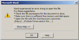
Common Problem
While trying to open the document from the SharePoint list, if you are getting the following error:

Solution
  1. Run one of the Office 2010 applications (e.g. Word 2010).
  2. Click on File menu, and select Options.
  3. In the “Options” dialog, select Trust Center in the left pane.
  4. Click on Trust Center Settings in the right pane.
  5. Select Protected View in the left pane of “Trust Center” dialog.
  6. Disable any of all of the protected view options as below by unchecking the check boxes:
    1. Enable Protected View for files that fail validation
    2. Enable Protected View for files originating from the Internet
    3. Enable Protected View for files located in potentially unsafe locations
    4. Enable Protected View for Outlook attachments

Version / Check in – Check out Settings
Open library à SettingsàDocument Library SettingsàVersioning SettingsàContent Approval: YesàVersion: Create Major VersionsàWho should see: Any user who can read itemsàRequire checkout: YesàOK

To Manage Permission of document library
Open library DSS forms à Settings à Document Library settings à Permissions for this document library
               
Creating a document template
In order to maintain uniformity of files in the document library, it is recommended to use a document template that the users can use while adding documents to the library
·         To create a document template : Create a new Word Document with the desired skeleton(template)
·         Open library à Settings à Document Library SettingsàAdvanced SettingsàDocument Template: [Edit Template]
We also create folders for better management of documents (New à Folder).  To copy a from one folder to another, the explorer view can be used (List à Explorer View (In Ribbon))
Document Workspace:
A Document Workspace enables you to collaborate on draft documents with selected coworkers. If documents and related materials such as tasks, objectives, and events are scattered, a Document Workspace site can help you to keep them all in one place.
}  A Document Workspace provides
}  A document library for storing primary documents and their supporting files.
}  A task list for assigning to-do items.
}  A links list for listing resources that are related to the documents.
}  A members list that shows who has access to the site.
How to create a document workspace:
  1. In SharePoint: From a document that is already in a document library. Use this method if your file is already stored in a library on a SharePoint site. As you update the file on the Document Workspace, you can simultaneously update the original copy in the library with your changes.
  2. From a SharePoint site (Site Actions à More Options à Site à Document Workspace).  This method creates a Document Workspace when you are working on a SharePoint site in a Web browser. When you create a Document Workspace this way, you have more initial configuration options than you do with the other methods, and you can configure elements of the workspace such as the description, user permissions, and the last part of the workspace's Web address.
Note:
This is a temporary holding space. Don’t forget to put your document in its proper location once it is final.
If you created based on an existing doc in a library, use dropdown > choose Send To > Publish